
ESTONIA\FROZEN.BROЭСТОНИЯ\FROZEN.BRO
BRAND IDENTITY&PACKAGINGBRAND IDENTITY&PACKAGINGАЙДЕНТИКА И УПАКОВКА


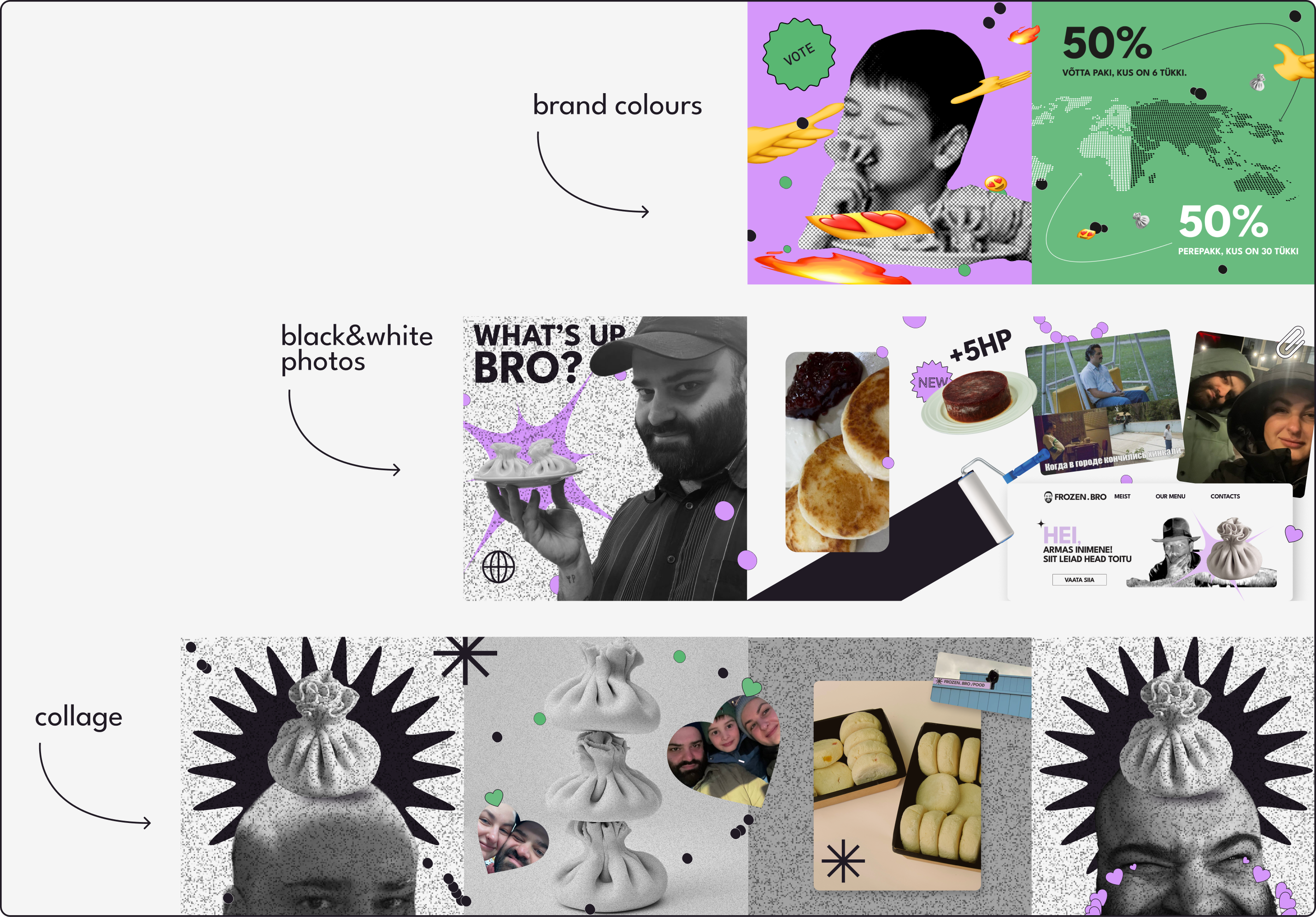
Project ContextКонтекст проекта
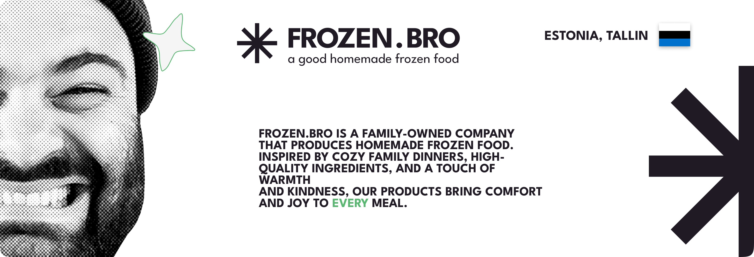
Frozen Bro reached out to me in 2023 for a systematic branding project. They
already
had a frozen product line and basic communications, and the team’s vibe was
instantly clear: lively, creative, and genuinely funny. The brand already felt
human
and warm. At the same time, the packaging and supporting materials were produced
in
different ways: some layouts were printed at home, and many decisions were made
case
by case depending on the task.Ребята из Frozen Bro пришли ко мне в 2023 году за комплексным брендингом. На тот момент у них уже вовсю продавалась заморозка, были какие-то базовые соцсети и, главное, понятный вайб: живой, творческий и с хорошим чувством юмора. Бренд изначально получался очень человечным и теплым. Правда, с визуалом был хаос: упаковку и полиграфию делали на коленке, что-то печатали чуть ли не дома, а решения принимались спонтанно под каждую задачу.
Early visuals by the founders:Первые наброски основателей:

processКак все строилось
We started with briefing and deep context work. On the strategic side, we
defined
what Frozen Bro is selling, how the lineup is structured, who the customer is,
and
where people meet the brand. A key intention was to support their own style and
taste in design and messaging, and to keep their tone of voice intact: warm,
friendly, and human, like good friends or neighbors, the kind of people you can
meet
through everyday life and end up sharing a good table and a fun evening with.Мы начали с брифа и погружения в контекст. Разложили по полочкам стратегию: что именно продают Frozen Bro, как устроена линейка, кто их клиент и где они вообще пересекаются. Главная цель: не ломать их собственный стиль, а упаковать его. Сохранить тот самый голос бренда — дружелюбный и свойский, как у классных соседей, с которыми легко можно затусить на кухне до утра.
Process visuals:Рабочие материалы:
Three guidesТри гайдбука в итоге
The project was structured into three blocks so the brand could immediately
function
as a practical tool.Чтобы бренд сразу стал рабочим инструментом, мы разбили проект на три практических блока.
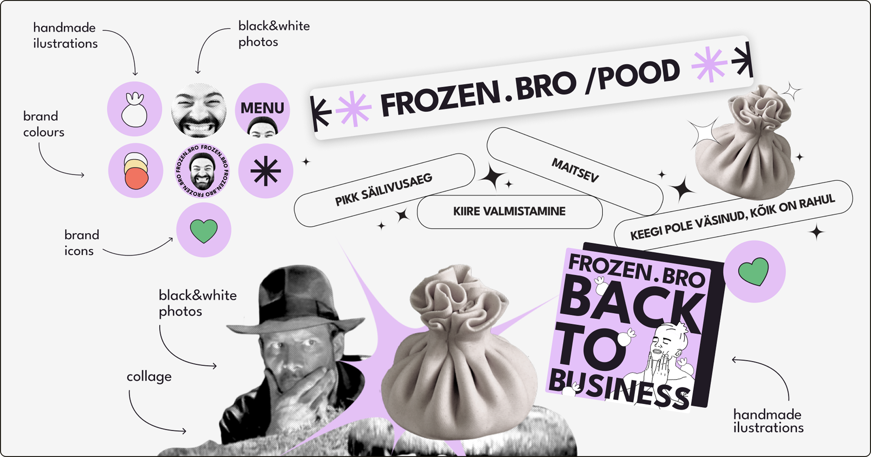
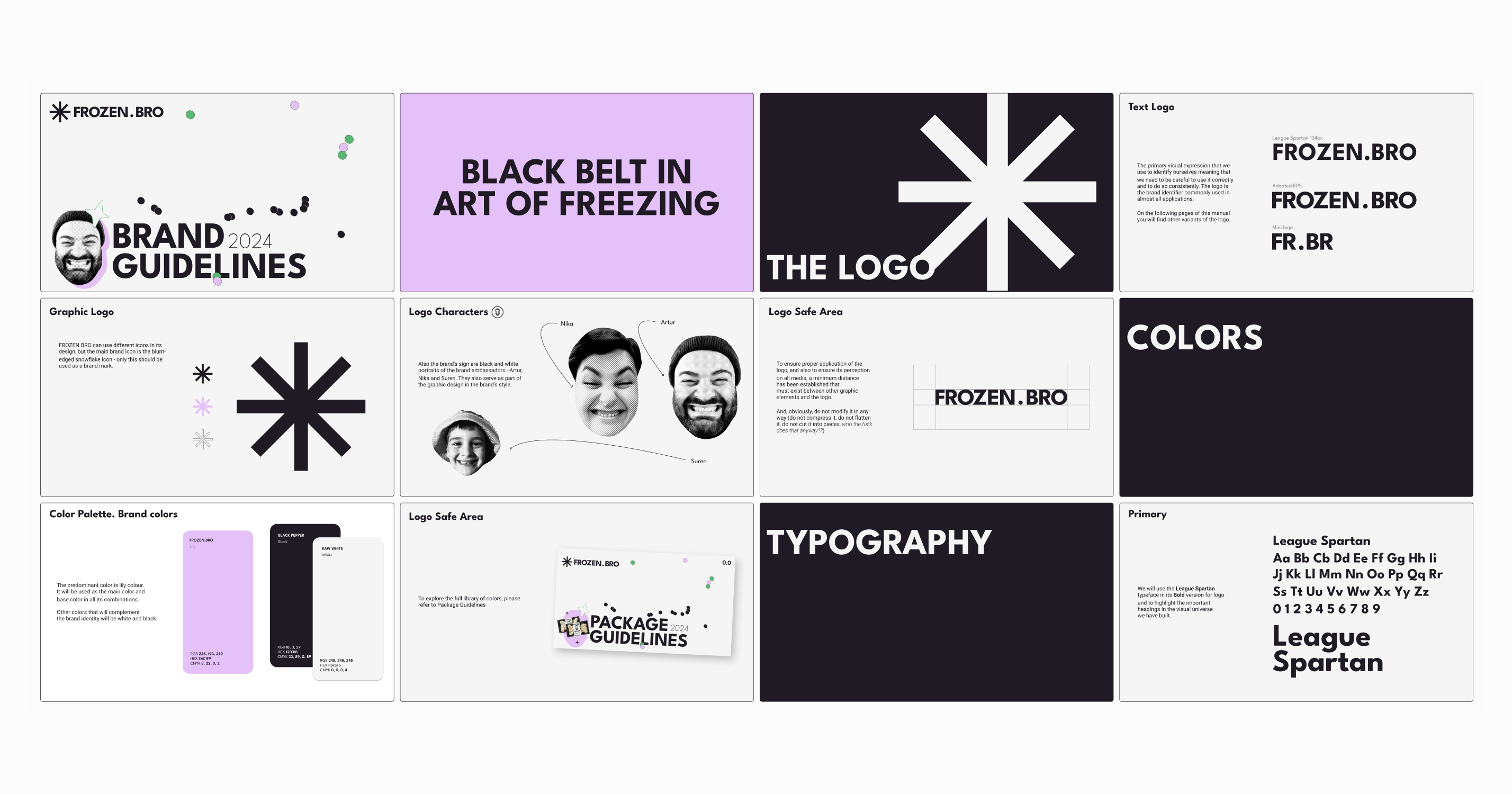
We built the foundation of the brand system, with a stronger emphasis on
communication and tone of voice. Frozen Bro has a focused, niche audience, and
the
founders meet people in person at festivals and events, so the way the brand
speaks
matters as much as how it looks. At this stage, the priority was to define a
clear,
human voice for everyday conversations and content: approachable, recognizable,
and
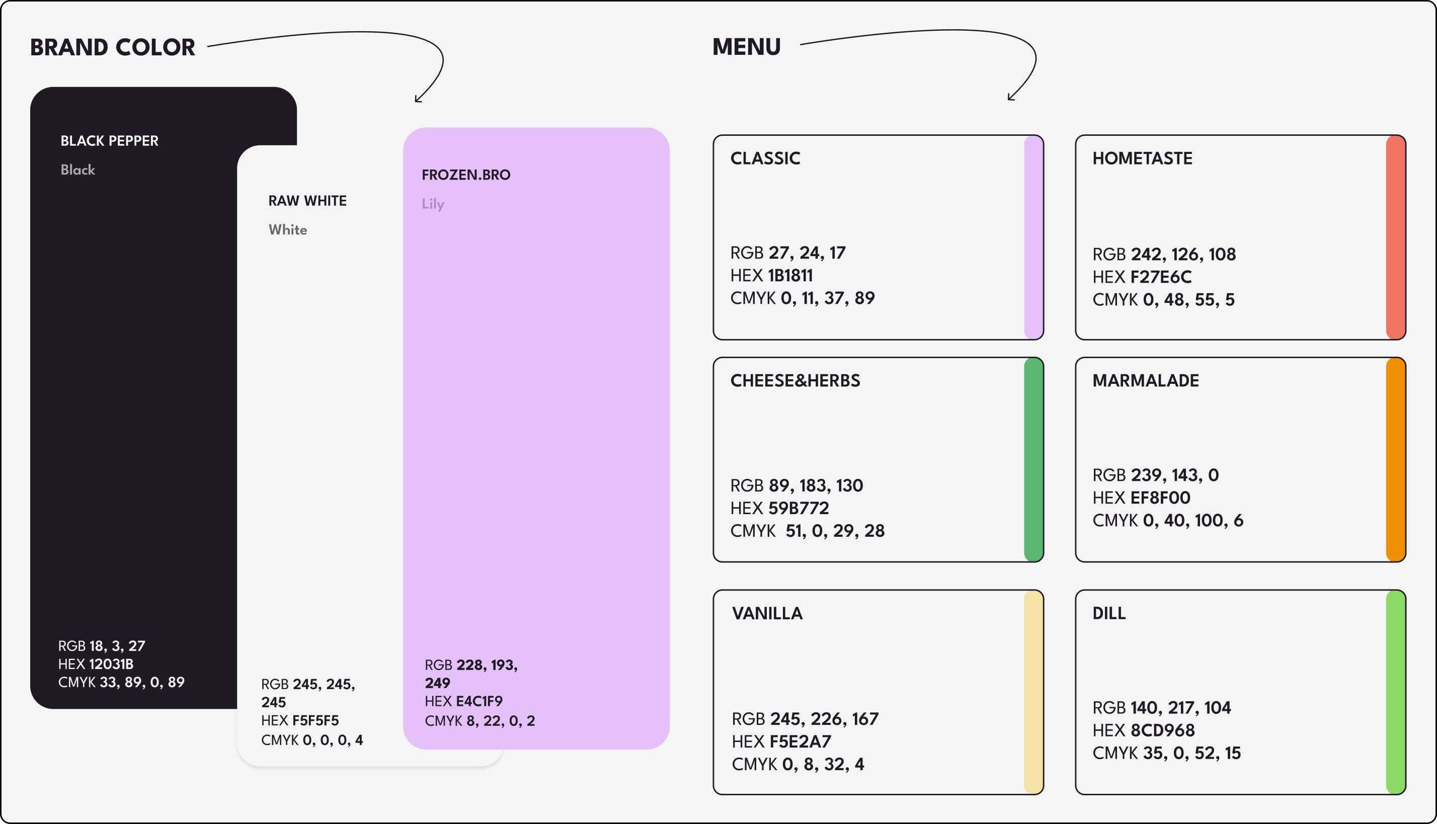
consistent across touchpoints.Основа системы: коммуникация и тон
У Frozen Bro классная нишевая аудитория, а фаундеры сами стоят за стойкой на маркетах и фестивалях. Поэтому то, как бренд разговаривает, здесь важно не меньше, чем визуал. На этом этапе мы прописали правила для повседневного общения и контента: как оставаться узнаваемыми, живыми и цельными на любой площадке.
У Frozen Bro классная нишевая аудитория, а фаундеры сами стоят за стойкой на маркетах и фестивалях. Поэтому то, как бренд разговаривает, здесь важно не меньше, чем визуал. На этом этапе мы прописали правила для повседневного общения и контента: как оставаться узнаваемыми, живыми и цельными на любой площадке.
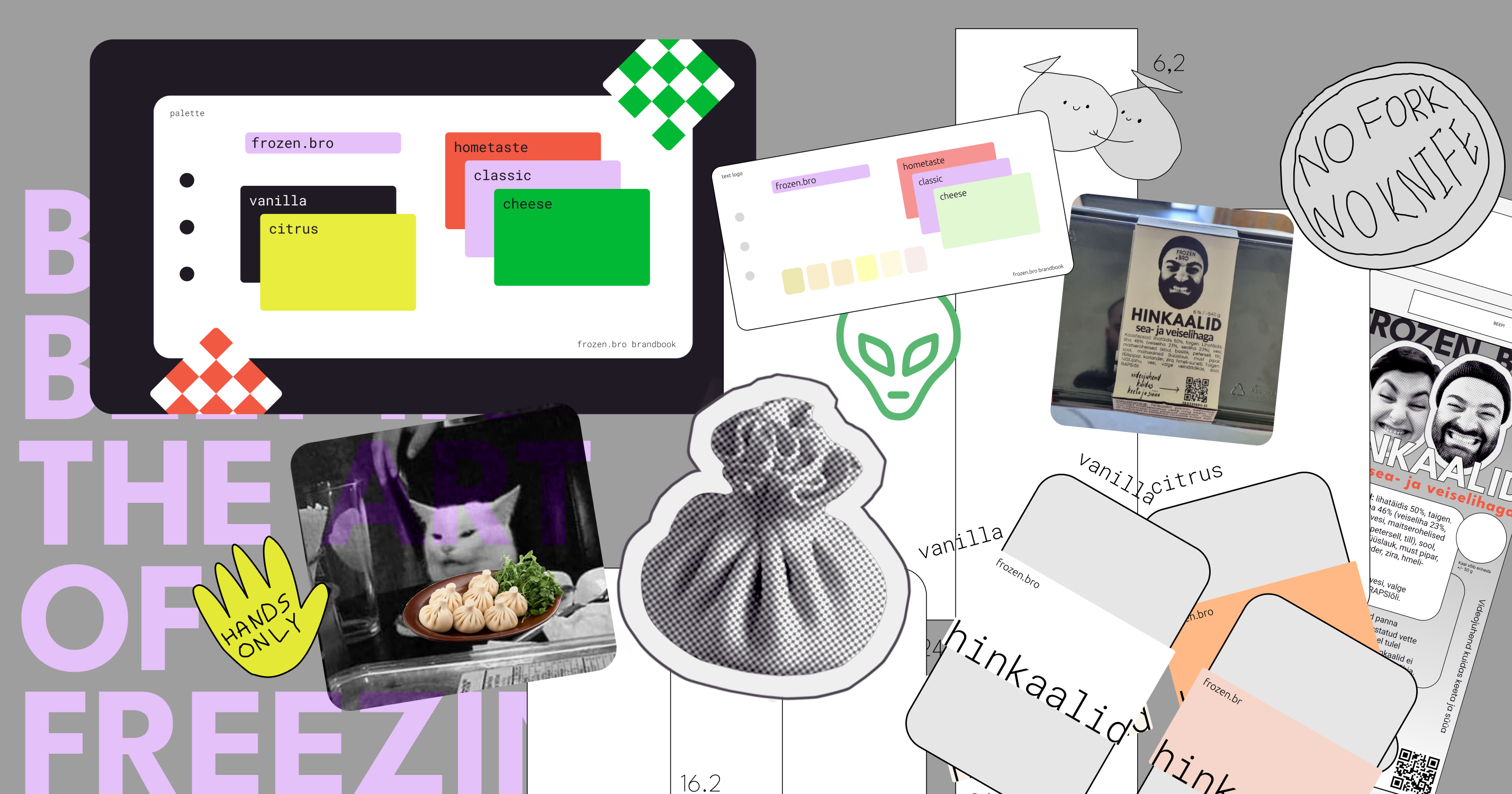
Part of Base Brandbook:Раздел базового брендбука:
Packaging guidelineГайдлайн по упаковке
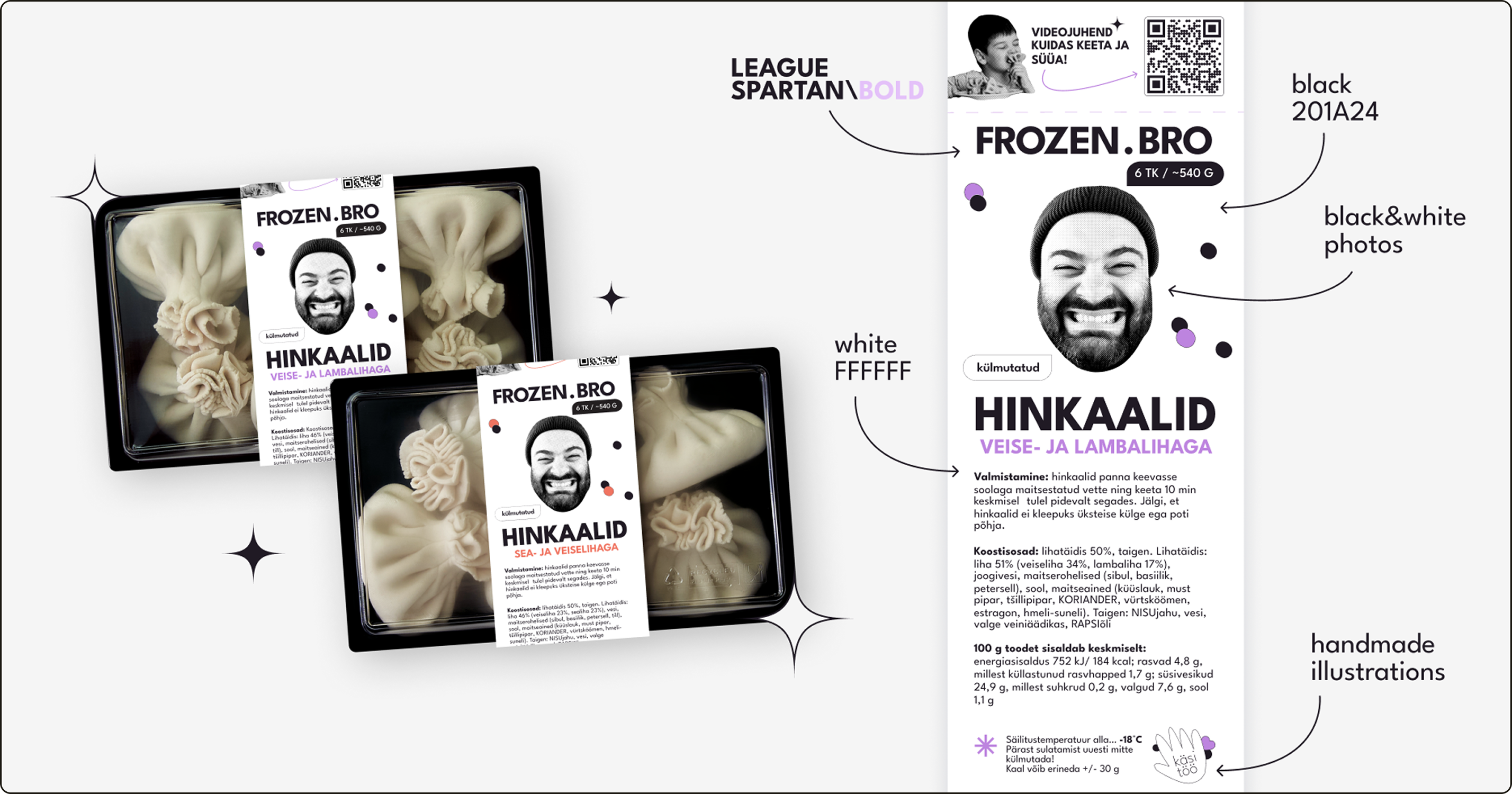
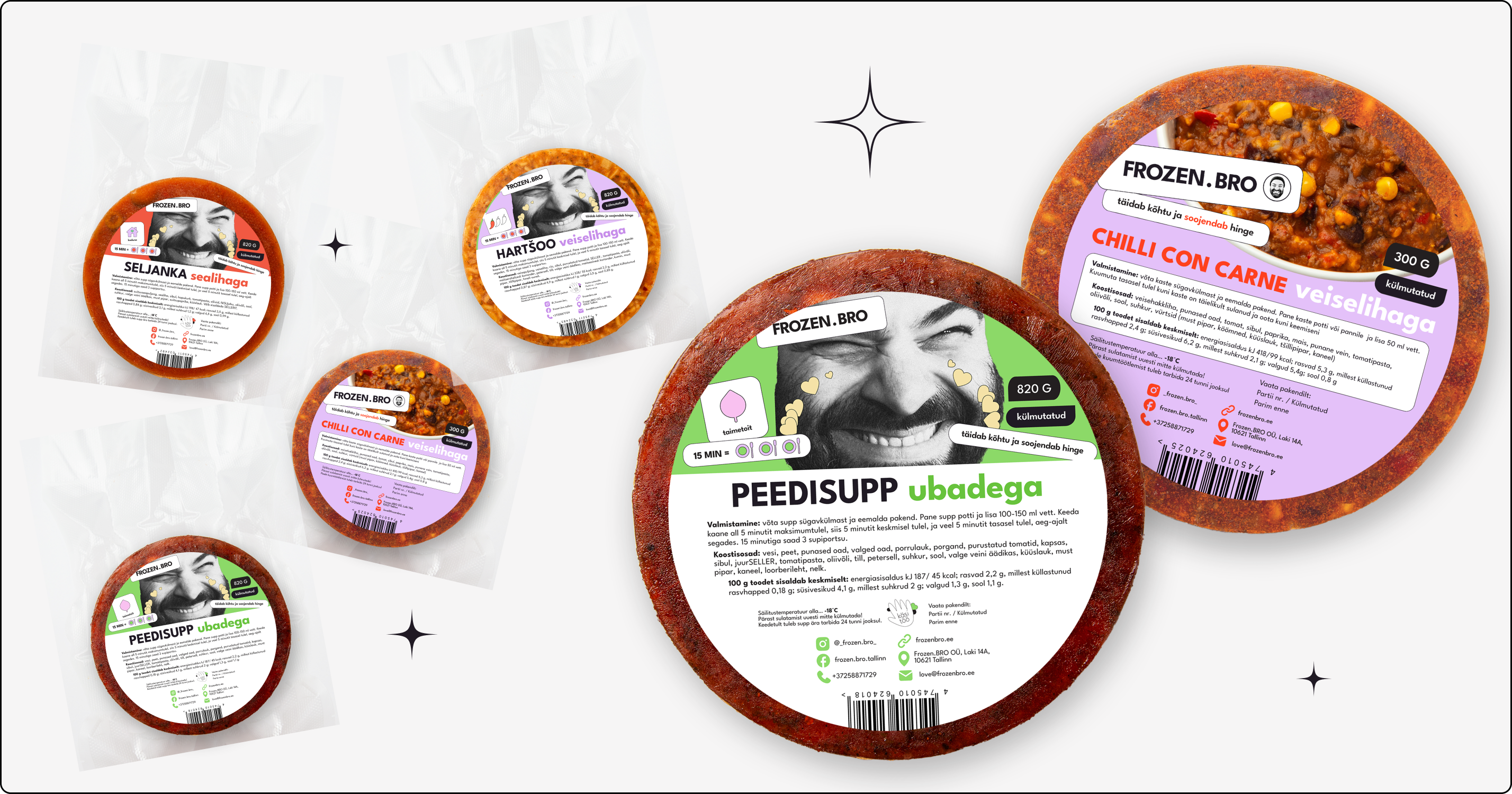
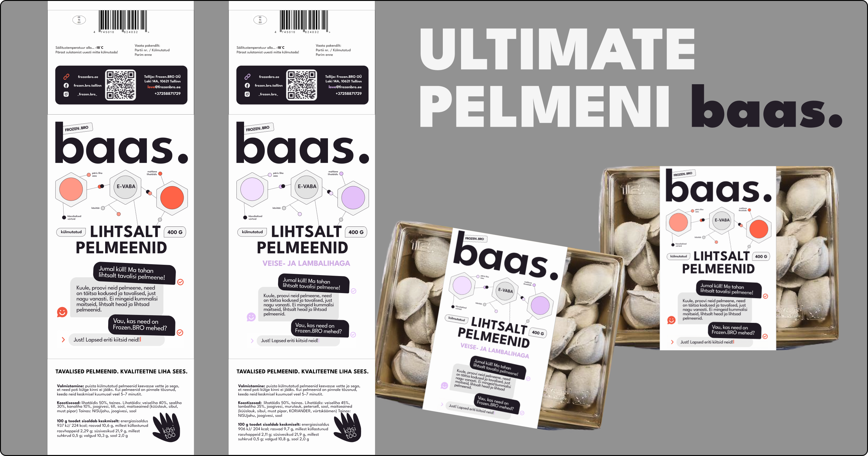
This was the most practical part of the project. For the frozen product line, we
designed belly bands for the packaging as well as additional stickers. The goal
was
to strengthen shelf presence and standardize the look of the lineup.Самая прикладная часть работы. Для заморозки мы придумали картонные обечайки и систему стикеров. Задача: сделать так, чтобы продукт выделялся на полке, а вся линейка выглядела аккуратно и в одном стиле.
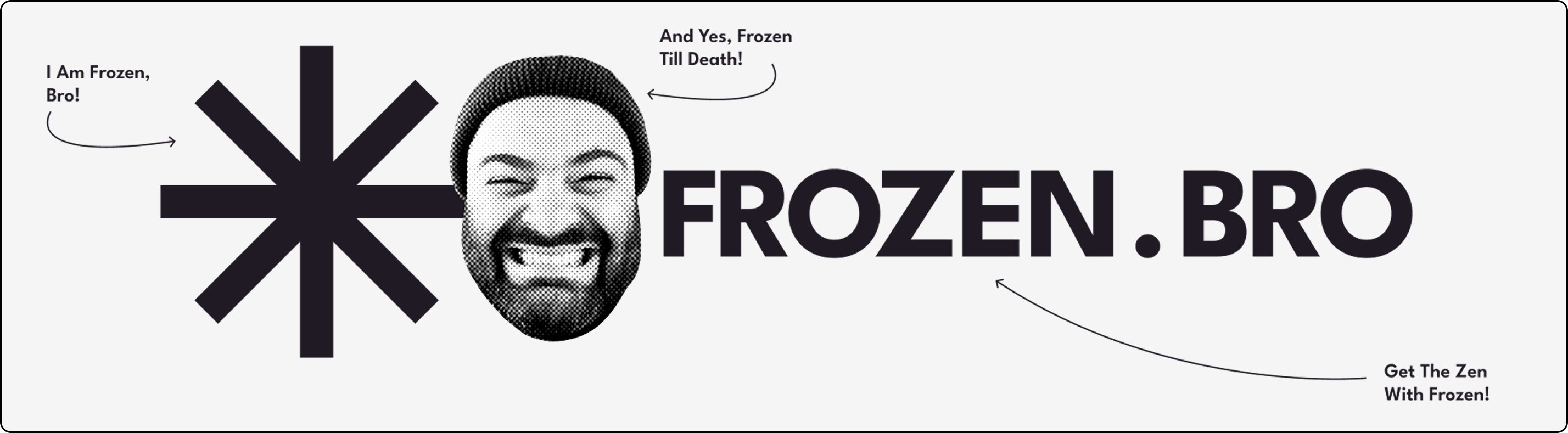
Part of Package Brandbook:Раздел гайдлайна по упаковке:
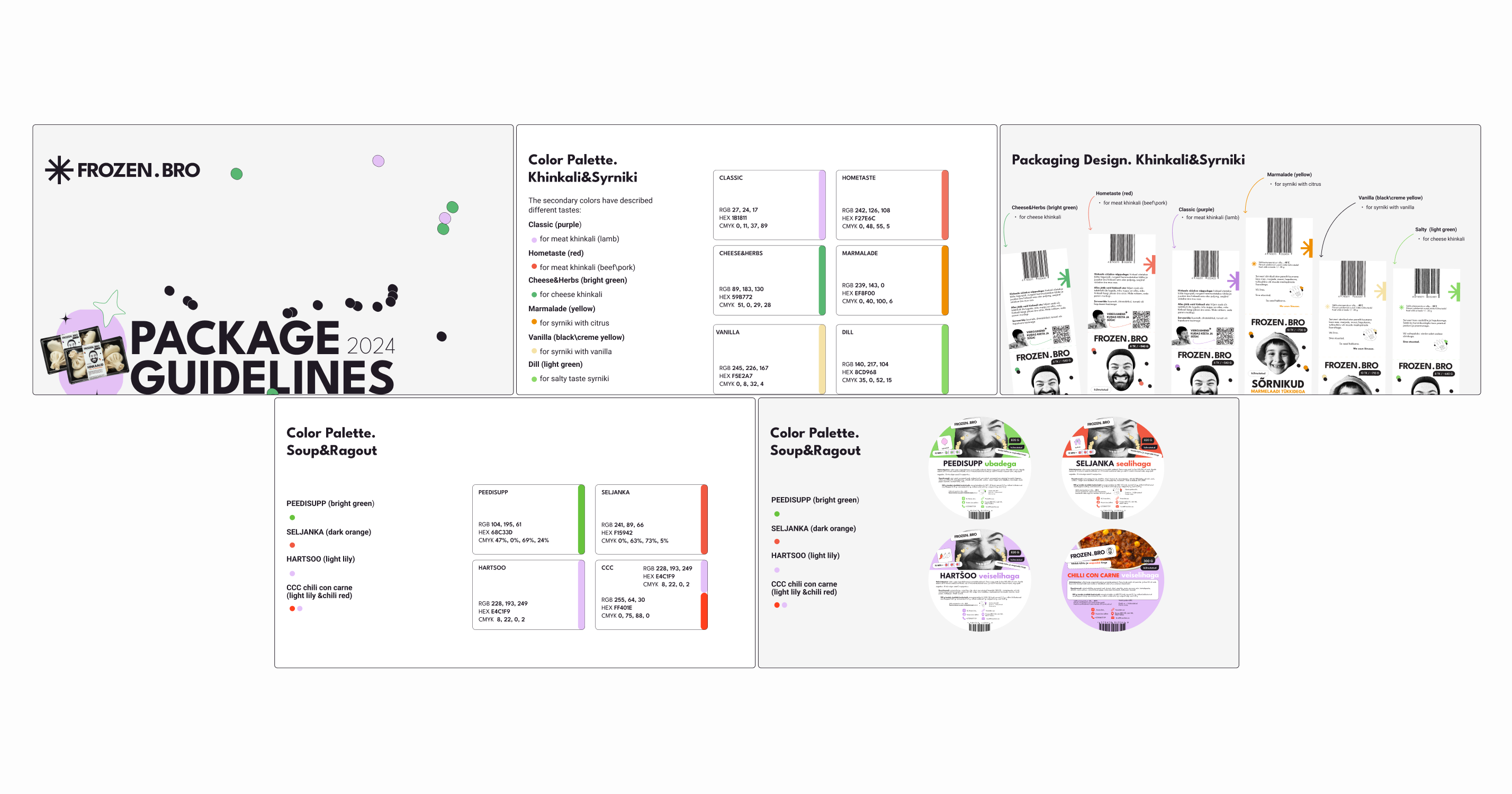
One of the brand’s most recognizable signatures is the “logo” itself: a real
face,
used as a bold and memorable marker across touchpoints. We leaned into that idea
and
made it a repeating motif in the packaging system, so the lineup stays instantly
identifiable even when formats, flavors, or product types change. Instead of
following the typical frozen-food visual codes, we chose a minimal, distinctive
direction that feels true to Frozen Bro and stands apart from competitors.
Alongside
the design work, we organized food photoshoots, handled retouching, and prepared
a
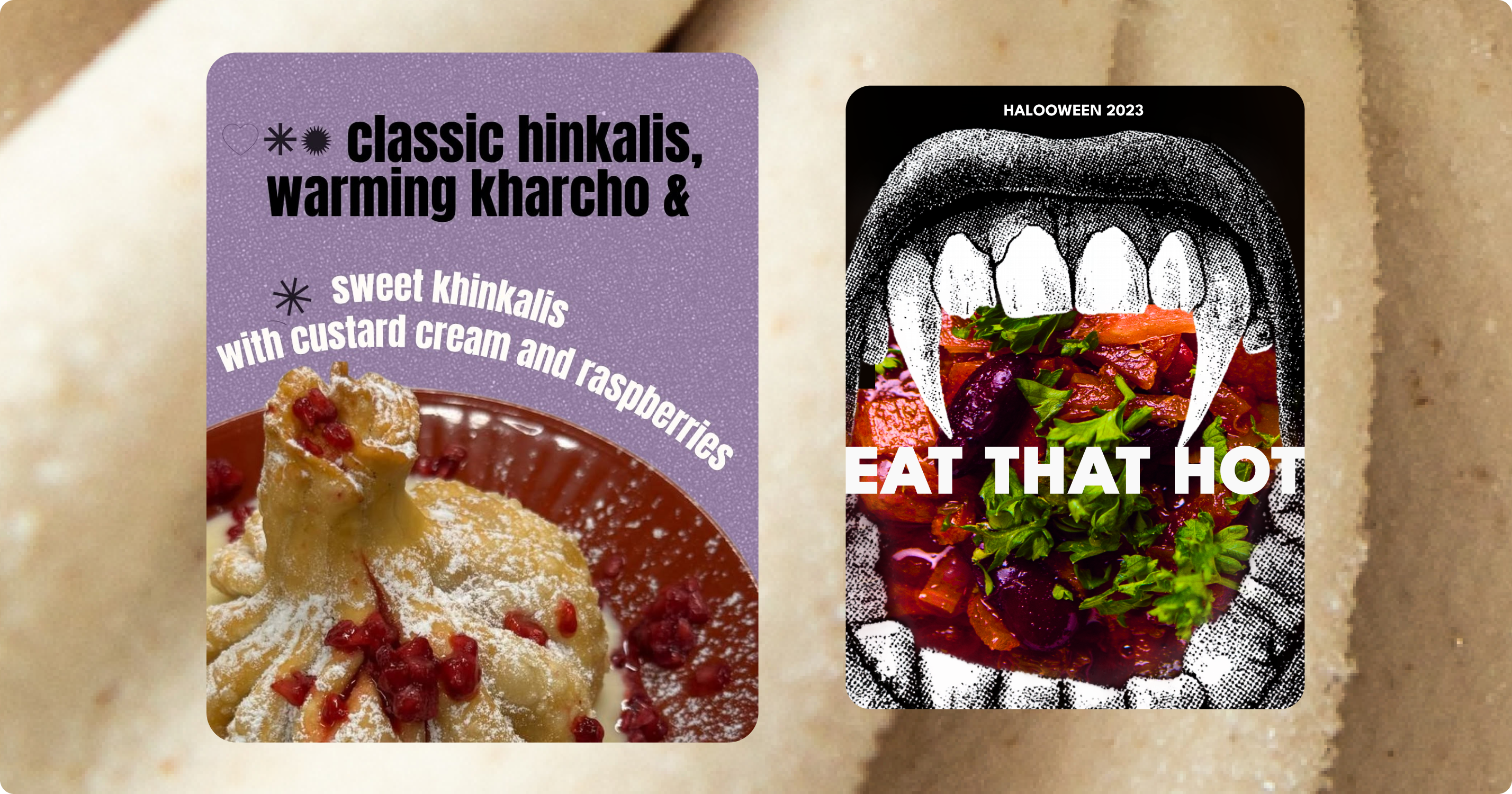
consistent set of visual assets for packaging and content production.Главная фишка бренда — «логотип» в виде реального лица. Мы зацепились за этот образ и превратили его в сквозной элемент упаковки. Теперь бренд считывается моментально, независимо от формата или вкуса внутри. Вместо стандартных штампов для замороженных полуфабрикатов мы ушли в минимализм, который выглядит самобытно и отстраивает ребят от конкурентов. В процессе мы также провели фуд-съемку, отретушировали кадры и собрали базу визуалов для упаковки и постов.
Food Photo and Retouche:Фуд-съемку и ретушь:

Social media guidelineГайдлайн по соцсетям
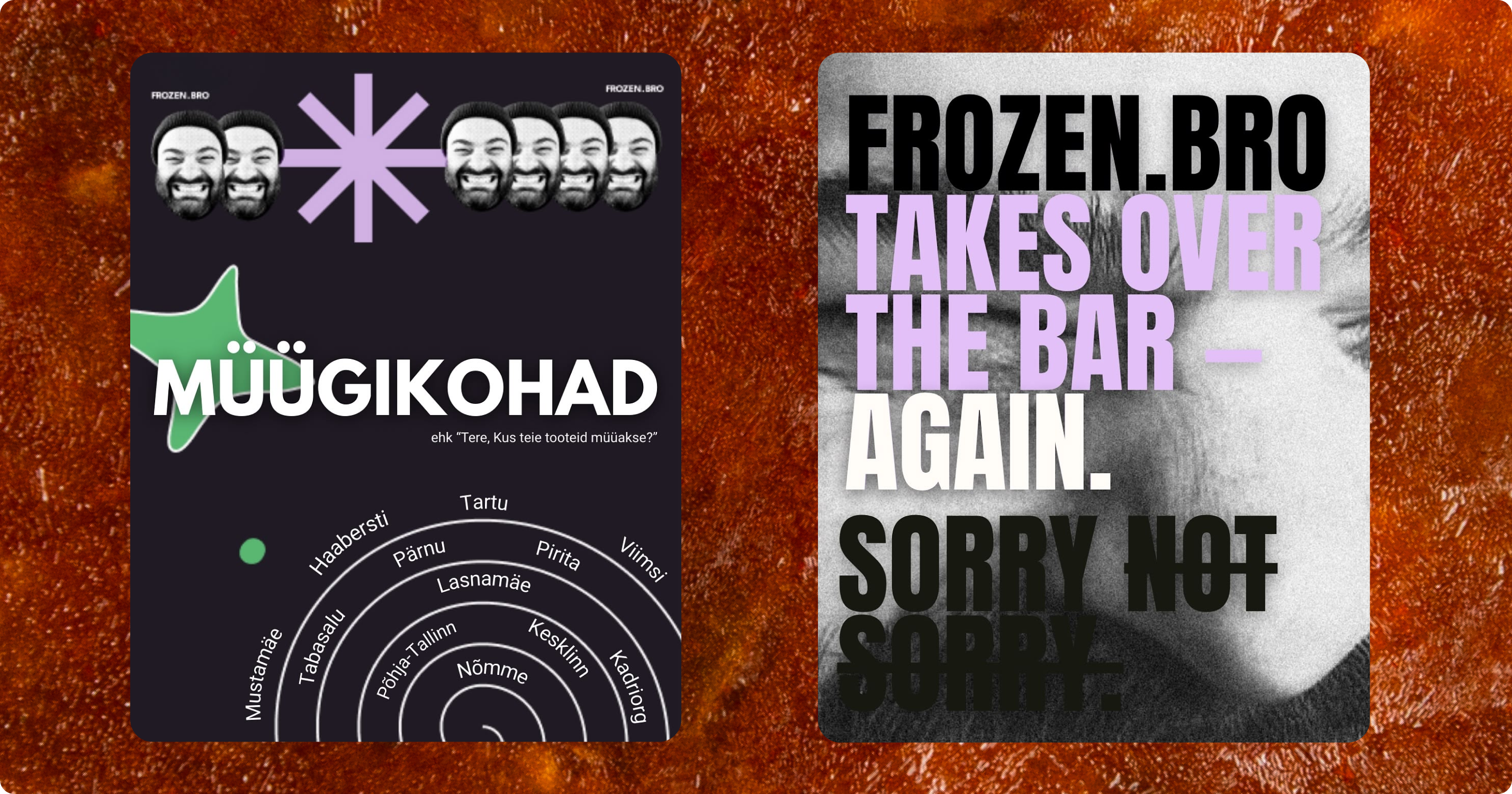
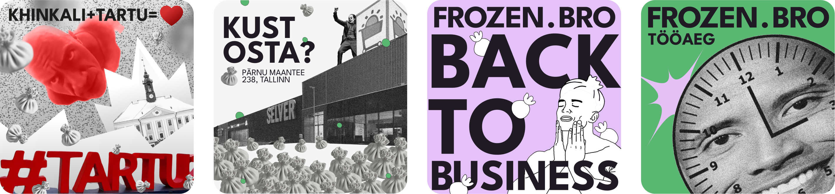
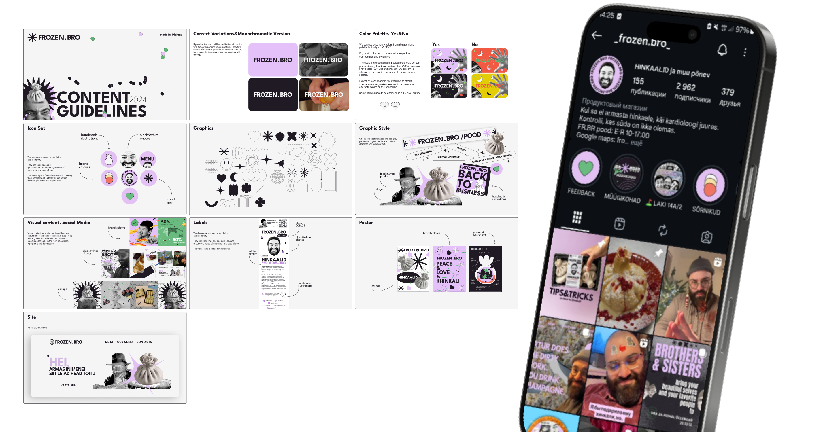
Frozen Bro is constantly filming and sharing what they do: day-to-day kitchen
life,
work processКак все строилось, product moments, and real meetings with people around food. The
brand
system was built to support that rhythm, so it integrates naturally with short
videos, posts, stories, and quick announcements without losing consistency. We
documented the rules and templates in a clear, practical way, so the team can
produce and format their own creatives independently. This removed the need to
hire
a designer for every post and helped them keep the channel active, recognizable,
and
true to their voice.Frozen Bro постоянно в эфире: показывают внутреннюю кухню, процессы, продукт и гостей. Бренд-система создавалась под этот темп, так что дизайн легко адаптируется под рилсы, сторис и быстрые анонсы. Все правила и шаблоны мы зафиксировали в простом виде, чтобы команда могла собирать креативы сама. Больше не нужно дергать дизайнера ради каждой картинки, можно вести соцсети быстро, регулярно и в своем стиле.
Part of Content (SM) Brandbook:Раздел гайдлайна по SMM:
VISIT US FROZENBRO.EE
LOOK OTHER PROJECTS
LET'S WORK
TOGETHER
If you need an autonomous designer to launch a project from scratch, strengthen an in-house team, or establish a long-term contract partnership, let's connect.
